Why Simple?
Complex logos are the thing of the past. You just need to look around to see it for yourself. Did you notice that:
• The majority of big companies have very simple logos
• The most popular web sites use very simple logos and graphics
• When a big company redesigns logo it’s always simpler than the previous one
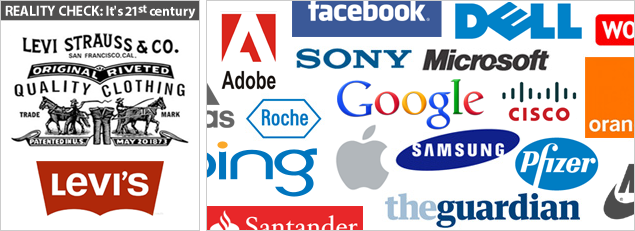
Your logo doesn’t need to convey everything that you do. Facebook logo doesn’t have silhouettes of people holding hands and there is no Earth globe with magnifier glass in Google logo. And would you really trust a savings fund with banknotes and profit graph in their logo? If there’s a creative opportunity for an elegant hint at anything related to your web site, business or your business name, we will consider taking it; otherwise we will stay off any unnecessary complexity. But we will always make sure that it’s a professional and still unique design.
It’s 21th century. In a couple of years the number of mobile Internet page views will be equal to those made from desktop computers. The simpler you logo is, the higher are chances that it will render well on different web-accessible devices. The simpler it is, the easier it will be to print it on apparel and office promo products or to use it as a watermark.
We are seasoned professionals no matter the low prices of our services. With every project we put ourselves in a client’s shoes and design the way we would design the same for ourselves. Our mission is to provide you with a logo that you will actually use, to the lot of years to come.